Cumulative Style Sheets
Learn how to write CSS the optimized way and stay away from expensive refactoring.

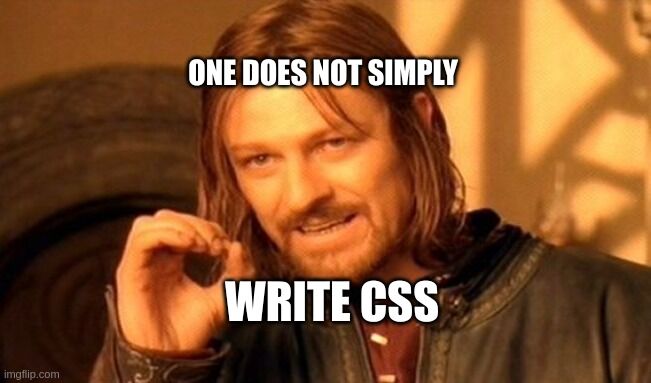
Let’s start with an example. How hard it is, to create a simple blue button? It’s like one selector, probably a hover state and a few properties. Something like this:
.button {
	font-size:18px;
	padding:8px 24px;
	background:#2196f3;
	color:#fff;
	border-radius:2px;
	border:0;
	display:inline-block;
	cursor:pointer;
}

.button:hover {
	background:#1e87db
}
With the same approach, we could create various dropdowns, sidebars, titles, sections, etc. But…
Is the code and the approach above the right way to do so?
Well… 🤷.
The Problem
Every time, you create a new component or style a section, you increase the size of your CSS. What happens if we add a border radius to an image and font-size to some text?
.button { /* ... */ border-radius:2px; /* ... */ }
img { border-radius:2px; /* Duplicated */ }
.subtitle { font-size:18px /* Duplicated */ }
The Solution
The solution I see as a better way of writing the CSS for our button is mixing components and utilities:
.hover\:background\:\#1e87db:hover,
.button:hover { background: #1e87db }
.font-size\:16px, .button { font-size: 16px }
.padding\:8px_24px, .button { padding: 8px 24px }
.background\:\#2196f3, .button { background: #2196f3 }
.color\:\#fff, .button { color: #fff }
.border-radius\:2px, .button { border-radius: 2px }
.border\:0, .button { border: 0 }
.display\:inline-block, .button { display: inline-block }
.cursor\:pointer, .button { cursor: pointer }
When you look at the code you will probably think something like “What the hell is that?“.
Let me explain: Every property:value you add to the CSS should also be a utility:
- You can reuse them easily anywhere There are fewer duplicated properties
- The bigger the project, the more classes get reused, which means the CSS size will grow slowly
Ok, but who would want to write something like this manually? The good news is, you don’t have to.
Stylify CSS to the rescue
Exactly because of the reasons above, stylifycss.com have been created.
Here is an example, of how to create the same button with the Stylify CSS (Check out the HTML tab):
See the Pen Stylify - button by Vladimír Macháček (@Machy8) on CodePen.
The CSS selectors can also be minified when used in node.js:
<button class="a"></button>
<style>
.b:hover, .a:hover { background: #1e87db }
.c,.a { font-size: 16px }
.d,.a { padding: 8px 24px }
.e,.a { background: #2196f3 }
.f,.a { color: #fff }
.g,.a { border-radius: 2px }
.h,.a { border: 0 }
.i,.a { display: inline-block }
.j,.a { cursor: pointer }
</style>
In case you also take the time and separate your CSS for layout and each page separately (which is easy to do with Stylify) you can have a really small CSS chunk for each of your pages. You also don’t have to care about duplicates and the selectors get minified automatically.