StylifyCSS.com - 更快地编写CSS
更快地编写CSS
- 零学习曲线。不要把时间浪费在研究CSS框架上
- 减少HTML/CSS文件之间的切换
- 自动和极度调谐的CSS优化。
- 简单的CSS 布局/页面的捆绑式分割。
- 轻松地可配置和可扩展
- 无缝的安装。
- 迁移指南来自其他框架和库的迁移指南
- 预备、复制和粘贴、无头组件等
<!--
Edit Me 😎!
Write selectors as CSS property:value
Use _ for a space and ^ for a quote
-->
<img src="/images/p1.jpg" class="
		height:120px
		width:auto
		border-radius:4px
		transition:.3s
		hover:scale:1.1
">
<!-- Edit Me 😎! Write selectors as CSS property:value Use _ for a space and ^ for a quote --> <img src="/images/p1.jpg" class=" height:120px width:auto border-radius:4px transition:.3s hover:scale:1.1 ">
.border-radius\:4px{
	border-radius: 4px
}
.height\:120px{
	height: 120px
}
.hover\:scale\:1\.1:hover{
	scale: 1.1
}
.transition\:\.3s{
	transition: .3s
}
.width\:auto{
	width: auto
}
.z{
border-radius: 4px
}
.zp{
height: 120px
}
.zo:hover{
scale: 1.1
}
.dr{
transition: .3s
}
.cw{
width: auto
}<!-- Edit Me 😎! Write selectors as CSS property:value Use _ for a space and ^ for a quote --> <img src="/images/p1.jpg" class=" zp cw z dr zo ">
<!--
stylify-components
	'image': `
		height:100px
		width:auto
		border-radius:4px
		transition:.3s
		margin:0_8px
		hover:scale:1.1
	`
/stylify-components
-->
<img src="/images/p1.jpg" class="image">
<img src="/images/p2.jpg" class="image">
<!-- stylify-components 'image': ` height:100px width:auto border-radius:4px transition:.3s margin:0_8px hover:scale:1.1 ` /stylify-components --> <img src="/images/p1.jpg" class="image"> <img src="/images/p2.jpg" class="image">
.image{
	border-radius: 4px
}
.image{
	height: 100px
}
.image{
	margin: 0 8px
}
.image:hover{
	scale: 1.1
}
.image{
	transition: .3s
}
.image{
	width: auto
}
.zq{
border-radius: 4px
}
.zq{
height: 100px
}
.zq{
margin: 0 8px
}
.zq:hover{
scale: 1.1
}
.zq{
transition: .3s
}
.zq{
width: auto
}<!-- stylify-components 'image': ` height:100px width:auto border-radius:4px transition:.3s margin:0_8px hover:scale:1.1 ` /stylify-components --> <img src="/images/p1.jpg" class="zq"> <img src="/images/p2.jpg" class="zq">
<!--
stylify-customSelectors
	img: `
		height:100px
		width:auto
		border-radius:4px
		transition:.3s
		hover:scale:1.1
	`
/stylify-customSelectors
-->
<img src="/images/p3.jpg" class="[&+img]{margin-left:8px}">
<img src="/images/p4.jpg">
<!--
stylify-customSelectors
img: `
height:100px
width:auto
border-radius:4px
transition:.3s
hover:scale:1.1
`
/stylify-customSelectors
-->
<img src="/images/p3.jpg" class="[&+img]{margin-left:8px}">
<img src="/images/p4.jpg">img{
border-radius: 4px
}
img{
height: 100px
}
.\[\&\+img\]\{margin-left\:8px\}+img{
margin-left: 8px
}
img:hover{
scale: 1.1
}
img{
transition: .3s
}
img{
width: auto
}img{
border-radius: 4px
}
img{
height: 100px
}
.zs+img{
margin-left: 8px
}
img:hover{
scale: 1.1
}
img{
transition: .3s
}
img{
width: auto
}<!-- stylify-customSelectors img: ` height:100px width:auto border-radius:4px transition:.3s hover:scale:1.1 ` /stylify-customSelectors --> <img src="/images/p3.jpg" class="zs"> <img src="/images/p4.jpg">
<!--
stylify-variables
	height: '120px',
	radius: '4px',
	scale: '1.1'
/stylify-variables
-->
<img src="/images/p3.jpg" class="
	width:auto
	transition:.3s
	height:$height
	border-radius:$radius
	hover:scale:$scale
">
<!-- stylify-variables height: '120px', radius: '4px', scale: '1.1' /stylify-variables --> <img src="/images/p3.jpg" class=" width:auto transition:.3s height:$height border-radius:$radius hover:scale:$scale ">
:root {
	--height: 120px;
	--radius: 4px;
	--scale: 1.1;
}
.border-radius\:\$radius{
	border-radius: var(--radius)
}
.height\:\$height{
	height: var(--height)
}
.hover\:scale\:\$scale:hover{
	scale: var(--scale)
}
.transition\:\.3s{
	transition: .3s
}
.width\:auto{
	width: auto
}
:root {
--height: 120px;
--radius: 4px;
--scale: 1.1;
}
.zv{
border-radius: var(--radius)
}
.zu{
height: var(--height)
}
.zt:hover{
scale: var(--scale)
}
.dr{
transition: .3s
}
.cw{
width: auto
}<!-- stylify-variables height: '120px', radius: '4px', scale: '1.1' /stylify-variables --> <img src="/images/p3.jpg" class=" cw dr zu zv zt ">
<!--
	Screens can be static: sm, lg, md
	Dynamic: miw640px, rng400px-800px
	Combined using logical operands
	- lg&&landscape
	- sm||lg
-->

<img src="/images/p2.jpg" width="120" height="120" class="
	object-fit:cover

	border-radius:4px
	sm:border-radius:12px
	minw600px:border-radius:24px
	lg||landscape:border-radius:120px
">
<!-- Screens can be static: sm, lg, md Dynamic: miw640px, rng400px-800px Combined using logical operands - lg&&landscape - sm||lg --> <img src="/images/p2.jpg" width="120" height="120" class=" object-fit:cover border-radius:4px sm:border-radius:12px minw600px:border-radius:24px lg||landscape:border-radius:120px ">
.border-radius\:4px{
	border-radius: 4px
}
.object-fit\:cover{
	object-fit: cover
}

@media (min-width: 600px) {
.minw600px\:border-radius\:24px{
	border-radius: 24px
}
}

@media (min-width: 640px) {
.sm\:border-radius\:12px{
	border-radius: 12px
}
}

@media (min-width: 1024px), (orientation: landscape) {
.lg\|\|landscape\:border-radius\:120px{
	border-radius: 120px
}
}
.z{
border-radius: 4px
}
.ch{
object-fit: cover
}
@media (min-width: 600px) {
.zx{
border-radius: 24px
}
}
@media (min-width: 640px) {
.zw{
border-radius: 12px
}
}
@media (min-width: 1024px), (orientation: landscape) {
.zy{
border-radius: 120px
}
}<!-- Screens can be static: sm, lg, md Dynamic: miw640px, rng400px-800px Combined using logical operands - lg&&landscape - sm||lg --> <img src="/images/p2.jpg" width="120" height="120" class=" ch z zw zx zy ">
/*
https://stylifycss.com/en/docs/stylify/compiler#helpers

Helpers can be used within selectors or macros.
For example color:lighten(#000,10) is helper
for lightening color.

You can define your own easily within helpers option.
*/
new Compiler({
	helpers: {
		textPropertyType(value) {
			if (value === 'bold') {
				return 'font-weight';
			} else if (value === 'italic') {
				return 'font-style'
			} else if (value.includes('$')) {
				return 'color';
			}
		},
	},
	macros: {
		'text:(\\S+)'(match) {
			const property = this.helpers.textPropertyType(
				match.getCapture(0)
			);

			return {[property]: match.getCapture(0)}
		}
	}
});
预备的无头组件
复制&粘贴,无风格的组件,灵感来自于Material Design V3。
零学习曲线和更快的编码
使用类似于CSS的选择器,而不是编写CSS并在HTML和CSS文件之间切换。语法与CSS相似。使用_ 代替空格,使用^ 代替引用。
<h1 class="font-size:24px color:blue hover:color:lightblue lg:font-size:32px">
	Hello World!🎉
</h1>
自动和极度调整的CSS和HTML优化
CSS被动态地生成到CSS文件中,它被优化,HTML被处理。没有未使用的CSS被生成。不需要清除CSS。不需要创建CSS文件。由于连接选择器的内部算法,几乎没有重复的生成。
<!-- Production HTML -->
<h1 class="a b c d">
	Hello World!🎉
</h1>
/* Production CSS */
.a {font-size:24px}
.b {color:blue}
.c:hover {color:lightblue}
@media (min-width: 1024px) {
.d{ font-size: 32px }
}简单的CSS捆绑拆分
CSS捆绑可以被分割成多个文件。这比手动组合CSS更有效,而且还能使CSS输出更小。
const bundles = [
	// Use Glob syntax to map files
	{ files: [ 'templates/**/*.html' ], outputFile: 'global.css },
	// Split CSS for layouts
	{ files: [ 'layout.html' ], outputFile: 'layout.css' },
	// And for pages
	{ files: [ 'index.html' ], outputFile: 'index.css' }
];const config = {
variables: {
primary: '#01befe',
titleFontSize: '24px',
// Variables based on color scheme dark/light
dark: {
primary: '#fff'
},
// Variables based on screen size
'minw640px': {
titleFontSize: 38px
}
},
components: {
'section': 'max-width:1240px margin:0_auto_24px_auto',
// Dynamic components
'title(?:--(\\S+))?': ({ matches, variables, helpers, dev }) => {
const color = matches[1] ?? '#000';
return `font-size:24px${color ? ` color:${color}` : ''}`;
},
},
customSelectors: {
'*': 'box-sizing:border-box',
'h1,h2': 'margin-top:0 margin-bottom:12px md:margin-bottom:24px'
},
macros: {
'ml:(\S+?)': (match) => {
// ml:24px => will create => margin-left: 24px
return {'margin-left': match.getCapture(0)}
}
},
}在文件中配置变量、组件和全局选择器,在它们被使用的地方进行配置
组件、变量和全局选择器可以被定义在一个文件中,在那里它们被使用。这将组件的CSS和HTML封装到一个文件中。
<!--
stylify-variables
	blue: '#01befe'
/stylify-variables

stylify-components
	subtitle: 'font-size:24px margin-bottom:12px color:$blue'
/stylify-components
-->
<h2 class="subtitle">Subtitle 1</h2>
<h2 class="subtitle">Subtitle 2</h2>// This hook example converts px font size
// to REM and automatically calculates line height.
import {hooks} from '@stylify/stylify';
hooks.addListener('compiler:newMacroMatch', ({selectorProperties}) => {
const pixelUnit = selectorProperties['font-size'];
if (typeof pixelUnit === 'undefined' || !pixelUnit.endsWith('px')) {
return;
}
const pixelFontSize = Number(pixelUnit.slice(0,-2));
const remFontSize = pixelFontSize / 10;
selectorProperties['font-size'] = `${remFontSize}rem`;
selectorProperties['line-height'] = `${remFontSize * (pixelFontSize >= 28 ? 1.2 : 1.7)}rem`;
});曩昔的Stylify CSS

LukeshiruWebdev at Vangware
It's like Tailwind's JIT, but without having to learn new classnames, and following a really simple set of "rules". Great library!

Yoav GanbarEngineer at Builder.io and QwikDev
Write plain CSS just in a class?
Fair enough, I'm intrigued.
Fair enough, I'm intrigued.

蝉丸ファンCore committer of @webpack
It's similar to the Tailwind but more readable.

Phan An@vuejs core team member
This looks super interesting!


One of the Top Front-End Tools Of 2022By Louis Lazaris

One of the Top Development Languages on Product Hunt

Mentioned in TLDR.tech newsletter

Mentioned in Codrops newsletter

Mentioned in This Week In React newsletterBy Sébastien Lorber

Mentioned by Remix.run maintainer as a tool for generating CSS for RemixBy Chance Strickland

Mentioned in Web Tools Weekly as one of the Top 30 Tools of 2022

One of the Best Tailwind CSS Alternatives for 2023

Mentioned as one of the Top 7 Web dev tools that will make your life EASYBy Pritesh Kiri

Mentioned in Svelte newsletterBy Dani Sandoval

Mentioned in Symfony newsletterBy Javier Eguiluz

Mentioned in Jamstacked newsletterBy Brian Rinaldi

Mentioned in Feature NewsletterBy Gabriel Nunes

Mentioned in JSter newsletter as a tool for Writing CSS

Jorge Baumann.jsFull Stack Developer at One Beyond
[🔧] Do you know Stylify? It's an alternative to Tailwind #CSS that goes one step further.
🔤 Known syntax
📈 No learning curve
👩💻 Write normal CSS in classes
⚛️ Supports variables and components
🗜️ Works with Webpack, Rollup or Vite

Tomáš PilařCo-Founder & CTO Conviu.com
I recommend looking at stylifycss.com if you don't know that tool yet 👍. Launched on the first try with Symfony and it works like a charm! 👏

Posandu MapaFullstack dev
I like how Stylify compresses the utility classes. A good Tailwind CSS alternative.

Tom RavnWebdeveloper & SysAdmin
Have you heard about Stylify? Similar framework as #TailwindCSS. I guess when you finally learn #CSS using Tailwind you can go level deeper and use Stylify, you will basically write pure CSS into #html.😆

Reegan RajasekarFull Stack Web Developer
I just thought it's just another css library like tailwind. But Twitter recommend this every time. So i just checked what is this . But now I feel it's awesome. bcz it gives utility classes like tailwind but it uses css like class names . I gonna use this in my next projects.

Finn GuhaWebdev teacher
Wow, that seems like a promising concept! And one that seems very interesting to me personally. I am always amazed by new and unique concepts of writing CSS.

David Mario LiclaFront-End dev at Forma
🤯 Did you know that there is an alternative to TailwindCSS but only using CSS properties? Look it's called Stylify!

Toheeb OgunbiyiWeb-UI Engineer
Utility on steroids, I love this! No weird utility names, almost same as CSS. Chars as class names on production. Colocation of states within the rule makes a lot of sense too. This makes up for readability compared to others.

RinFull-Stack Developer
Immediately interested when I read features on documentation, give a shot with Astro and absolutely love it.

Michael AndreuzzaUI Designer & Front end dev
I like that mangling feature. I was using a library that uglifies the code exactly like that..very useful for some cases.

Oscar Lito M Pablo
We now can easily integrate/use in @stylifycss by @8machy any Material Design 3 ("Material You") @materialdesign themes generated using the new Material Theme Builder! Saves a lot of time!

David TerenTech Lead & Ruby and Rails Dev
It's one of the tools that enables me to create entirely reactive web, iOS and Android apps with little JS.

Reza QorbaniCTO & Co-Founder at QualiaID
I didn’t know about Stylify! Looks amazing! I love feathers such as minify Class Names which is missing from Tailwind 👍.

Arif UddinSoftware Developer at BitCode
Wish I know this library before. I can save my 1-month of work in our company, we did the mangling optimization for our product.

Japheth Mutai
Well, I guess we all need to follow @stylifycss to reduce our #CSS related nerve attacks 😂😂.

Muhi MasriFrontend Engineer
Just came across #stylifycss, which uses CSS-like selectors to generate optimized utility-first CSS dynamically. Excited to try it out!

Yousuf IqbalFull Stack Developer
This is awesome. Almost zero learning curve 👍!

Ahmad AlfyEngineering @robustastudio
It gives more freedom than the strictly confined design system in Tailwind.

Ahmad TahirFullstack Dev
Wow this looks neat 💯. I'll be checking it out.

Código de MarrasFrontend Developer
It's interesting, an alternative to having everything in a single file...

Ahmed ZougariReact developer
StylifyCSS is like Tailwind framework but easier to learn and read.

Jean-BaptisteCreator of Ardaria
Interesting project! Keep going guyz 💪

Darryl Yeo
This make so much more sense than Tailwind.

Ngmi
I'm notoriously bad with CSS, giving this a try 👾.

Miles Pernicious
Looks pretty cool so far 🤩.

Mubashar HashmatManager at Scorp
Extremely awesome 😎.

Xavi
Awesome, I'll try it later.

Lucas
Good job. I’ll give it a try !

Shushant LakhyaniJust Ship It Hub
This looks cool!

SibasishWeb Developer
@stylifycss = @tailwindcss - all the goodness of utility classes.

Mukesh
Seems cool ✌️✌️✌️

Paul⭐Bear
Very cool library!

sam i am
That's nice!

Musa Yazlık
Hmm. I like it. 😁

Eze ChukwuemekaTech Support
I love this

Mugiwara Superfly
Wow wow wow

Rajesh KhadkaTech Lead & Ruby and Rails Dev
May be next tailwind css. 🙃

G-WokWeb3 Developer
Looks cool

Alfred ChadáChief Technical Officer
Nice work

Ricardo AnayaFull Stack Developer
Cool!

RyuseFrontend developer
Interesting

Thiago TelesFullstack developer at Scriptcase
Nice
展示


不要研究框架。专注于编码!
作为一个开发者,你想轻松、快速地编写你的网站代码,并且不需要在文档中花费太多时间。框架、CSS-in-JS库和预处理器有很多伟大的功能,但它们也使开发变得更加复杂,迫使你研究语法、随机命名的选择器,以及如何使用不同的功能(在一周的假期后你可能会忘记这些功能🍹)。
Stylify专注于简单性,使用你已经知道的类似于CSS的选择器。这就像直接把纯CSS写进标记中,而不需要在文件之间切换,也不需要弄清楚选择器的名称。如果你知道CSS,你就知道如何使用Stylify。通过尝试Stylify,你会发现预处理器和简短的选择器是不必要的。

材料主题生成器集成指南
最新的博客文章

2023年2月24日
更快的React应用编码: 如何从Emotion CSS-in-JS迁移到Stylify Utility-First CSS。
想更快地设计你的React应用程序吗?了解如何轻松地从Emotion CSS-in-JS迁移到Stylify utility-first CSS,以便更好地开发React。
2023年2月16日
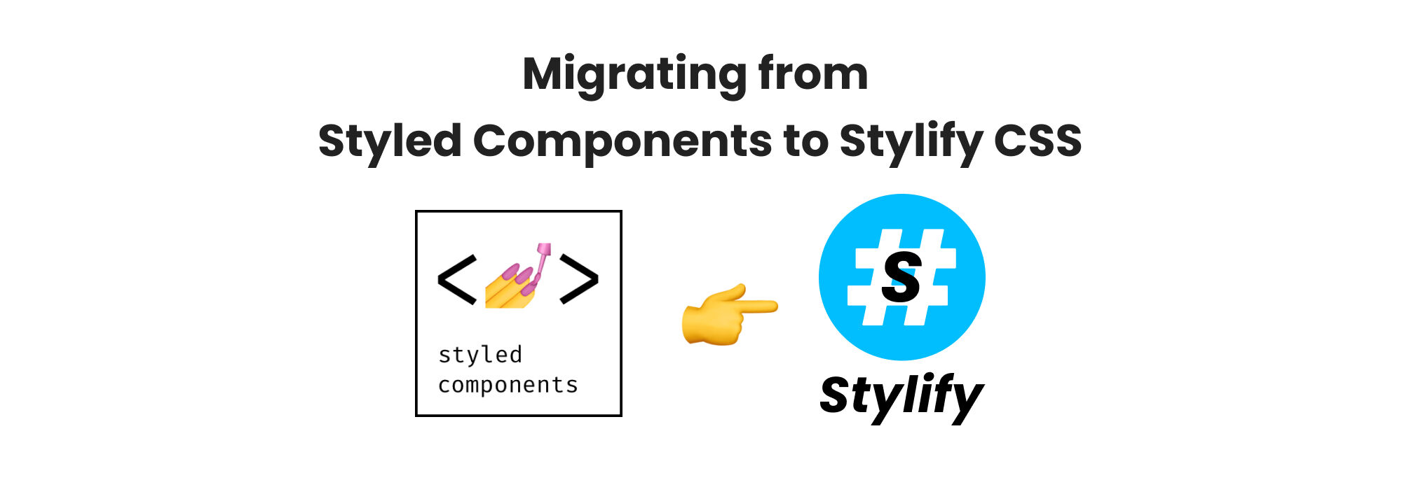
如何毫不费力地从Styled Components CSS-in-JS迁移到Stylify Utility-First CSS以获得更好的React开发。
了解如何轻松迁移到Stylify CSS,以便更好地开发React。
2023年2月2日
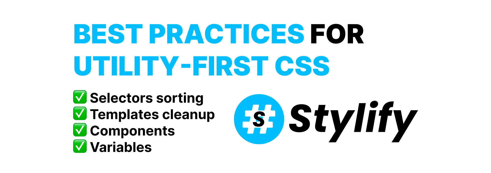
实用优先的CSS的最佳实践
了解如何有效地使用效用优先的CSS来为你的网站设计风格,同时避免臃肿的模板和维护困难。
去吧。试一试吧!
现在就在你的浏览器中或在Stack Blitz准备好的Vue、React、Next.js、Nuxt.js、Lit、Svelte和其他工具的游乐场中试试Stylify。