2022年10月10日
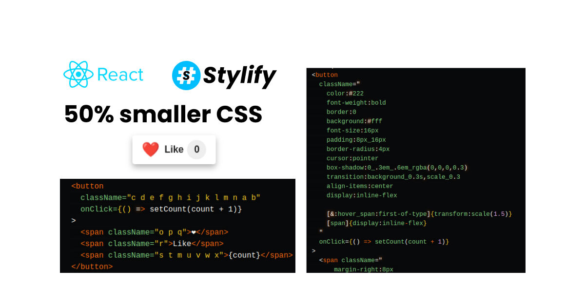
使用Stylify CSS的简单React like按钮。从实用工具,到组件,混杂的选择器和50%小的生产构建。
用Stylify CSS快速为React中的按钮样式。它就像直接在模板中写CSS一样。

看看如何只用实用工具快速设计一个按钮,然后用组件清理模板。了解为什么生产中的输出可以达到50%和更小🔥。
##介绍
Stylify是一个库,它使用类似于CSS的选择器,根据你写的东西生成优化的实用优先的CSS。
- ✅ 类似CSS的选择器
- ✅ 不需要研究框架
- ✅ 花在文档上的时间更少
- ✅ 纠结&极小的CSS
- ✅ 不需要清除CSS
- ✅ 组件、变量、自定义选择器
- ✅ 它可以生成多个CSS捆绑包
我们也有一个关于Stylify CSS解决了哪些问题,以及为什么你应该尝试一下!
代码
以下是按钮背后的代码:
import { useState } from 'react';
import './stylify.css';

function LikeButton() {
	const [count, setCount] = useState(0);

	return (
		<button
		className="
			color:#222
			font-weight:bold
			border:0
			background:#fff
			font-size:16px
			padding:8px_16px
			border-radius:4px
			cursor:pointer
			box-shadow:0_.3em_.6em_rgba(0,0,0,0.3)
			transition:background_0.3s,scale_0.3
			align-items:center
			display:inline-flex

			[&:hover_span:first-of-type]{transform:scale(1.5)}
			[span]{display:inline-flex}
		"
		onClick={() => setCount(count + 1)}
		>
		<span className="
			margin-right:8px
			font-size:24px
			transition:transform_0.3s
		">❤️</span>
		<span className="margin-right:6px">Like</span>
		<span
			className="
			background:#eee
			padding:4px
			align-items:center
			justify-content:center
			border-radius:50%
			min-width:24px
			min-height:24px
		">{count}</span>
		</button>
	);
}

export default LikeButton;
上面的例子的生成的CSS:
.color\:\#222{color: #222}
.font-weight\:bold{font-weight: bold}
.border\:0{border: 0}
.background\:\#fff{background: #fff}
.font-size\:16px{font-size: 16px}
.padding\:8px_16px{padding: 8px 16px}
.border-radius\:4px{border-radius: 4px}
.cursor\:pointer{cursor: pointer}
.box-shadow\:0_\.3em_\.6em_rgba\(0\,0\,0\,0\.3\){box-shadow: 0 .3em .6em rgba(0,0,0,0.3)}
.transition\:background_0\.3s\,scale_0\.3{transition: background 0.3s,scale 0.3}
.align-items\:center{align-items: center}
.\[span\]\{display\:inline\-flex\} span,
.display\:inline-flex{display: inline-flex}
.margin-right\:8px{margin-right: 8px}
.font-size\:24px{font-size: 24px}
.transition\:transform_0\.3s{transition: transform 0.3s}
.margin-right\:6px{margin-right: 6px}
.background\:\#eee{background: #eee}
.padding\:4px{padding: 4px}
.justify-content\:center{justify-content: center}
.border-radius\:50\%{border-radius: 50%}
.min-width\:24px{min-width: 24px}
.min-height\:24px{min-height: 24px}
.\[\&\:hover\_span\:first\-of\-type\]\{transform\:scale\(1\.5\)\}:hover span:first-of-type,
.transform\:scale\(1\.5\){transform: scale(1.5)}
生产构建—缩小50%
当你允许Stylify混合选择器时,那么输出就会像这样:
.c{color:#222}
.d{font-weight:bold}
.e{border:0}
.f{background:#fff}
.g{font-size:16px}
.h{padding:8px 16px}
.i{border-radius:4px}
.j{cursor:pointer}
.k{box-shadow:0 .3em .6em rgba(0,0,0,0.3)}
.l{transition:background 0.3s,scale 0.3}
.m{align-items:center}
.b span,.n{display:inline-flex}
.o{margin-right:8px}
.p{font-size:24px}
.q{transition:transform 0.3s}
.r{margin-right:6px}
.s{background:#eee}
.t{padding:4px}
.u{justify-content:center}
.v{border-radius:50%}
.w{min-width:24px}
.x{min-height:24px}
.a:hover span:first-of-type,.y{transform:scale(1.5)}
此外,JSX中的选择器也被最小化了
<button
	className="c d e f g h i j k l m n a b"
	onClick={() => setCount(count + 1)}
>
	<span className="o p q">❤️</span>
	<span className="r">Like</span>
	<span className="s t m u v w x">{count}</span>
</button>
CSS大小:
- 开发: 1101 bytes
- 生产型: 556字节
节省的大小约为50%(在gzipped模式下大小相似)。如果我们使用经过处理的HTML,差异会更大。
Template cleanup
如果我们有很多实用程序,想把它们移出模板,怎么办?通过Stylify,你可以使用可重复使用的组件来做到这一点。它们可以被定义在使用它们的文件的注释中(期望js对象没有周围的括号),或者在全局配置中。
// ...

/*
stylify-components
'like-button': `
	color:#222
	font-weight:bold
	border:0
	background:#fff
	font-size:16px
	padding:8px_16px
	border-radius:4px
	cursor:pointer
	box-shadow:0_.3em_.6em_rgba(0,0,0,0.3)
	transition:background_0.3s,scale_0.3
	align-items:center
	display:inline-flex
	span { display:inline-flex }
	&:hover span:first-of-type { transform:scale(1.5) }
`,
'like-button__hearth': 'margin-right:8px font-size:24px transition:transform_0.3s',
'like-button__counter': `
	background:#eee
	padding:4px
	align-items:center
	justify-content:center
	border-radius:50%
	min-width:24px
	min-height:24px
`
/stylify-components
*/

function LikeButton() {
	// ...

	return (
	<button className="like-button" onClick={() => setCount(count + 1)}>
		<span className="like-button__hearth">❤️</span>
		<span className="margin-right:6px">Like</span>
		<span className="like-button__counter">{count}</span>
	</button>
	);
}

// ...
在生产中,这些组件也被打乱了。
语法解释
在上面的例子中,你可以看到Stylify使用类似CSS的选择器。有一些不同之处。
- 选择器中的
_被用来代替空格 [span]{display:inline-flex}是一个内联的自定义选择器。这允许你对自定义选择器进行样式设计。[&:hover_span:first-of-type]里面的&总是指像SCSS中的上层- 组件中的缩进语法也和SCSS中一样。只是,为了保持简单,它只支持嵌套和链式。
span {
	display:inline-flex
}
&:hover span:first-of-type {
	transform:scale(1.5)
}
查看Stackblitz操场
你可以在Stackblitz上试试这个游乐场。