StylifyCSS.com - Write CSS faster
Write CSS Faster
Stylify uses CSS-like selectors color:blue, width:640px, margin:0_auto along with variables, components, custom selectors to generate optimized CSS dynamically based on what you write.
- Zero Learning Curve. Don't waste time studying CSS framework
- Less switching between HTML/CSS files
- Automagic and Extremely Tunned CSS Optimization
- Simple CSS Bundles Splitting for Layouts/Pages
- Easily Configurable and Extensible
- Seamless Installation
- Migration guides from other frameworks and libraries
- Prepared, Copy&Paste, Headless Components
<!--
Edit Me 😎!
Write selectors as CSS property:value
Use _ for a space and ^ for a quote
-->
<img src="/images/p1.jpg" class="
		height:120px
		width:auto
		border-radius:4px
		transition:.3s
		hover:scale:1.1
">
<!-- Edit Me 😎! Write selectors as CSS property:value Use _ for a space and ^ for a quote --> <img src="/images/p1.jpg" class=" height:120px width:auto border-radius:4px transition:.3s hover:scale:1.1 ">
.border-radius\:4px{
	border-radius: 4px
}
.height\:120px{
	height: 120px
}
.hover\:scale\:1\.1:hover{
	scale: 1.1
}
.transition\:\.3s{
	transition: .3s
}
.width\:auto{
	width: auto
}
.z{
border-radius: 4px
}
.zp{
height: 120px
}
.zo:hover{
scale: 1.1
}
.dr{
transition: .3s
}
.cw{
width: auto
}<!-- Edit Me 😎! Write selectors as CSS property:value Use _ for a space and ^ for a quote --> <img src="/images/p1.jpg" class=" zp cw z dr zo ">
<!--
stylify-components
	'image': `
		height:100px
		width:auto
		border-radius:4px
		transition:.3s
		margin:0_8px
		hover:scale:1.1
	`
/stylify-components
-->
<img src="/images/p1.jpg" class="image">
<img src="/images/p2.jpg" class="image">
<!-- stylify-components 'image': ` height:100px width:auto border-radius:4px transition:.3s margin:0_8px hover:scale:1.1 ` /stylify-components --> <img src="/images/p1.jpg" class="image"> <img src="/images/p2.jpg" class="image">
.image{
	border-radius: 4px
}
.image{
	height: 100px
}
.image{
	margin: 0 8px
}
.image:hover{
	scale: 1.1
}
.image{
	transition: .3s
}
.image{
	width: auto
}
.zq{
border-radius: 4px
}
.zq{
height: 100px
}
.zq{
margin: 0 8px
}
.zq:hover{
scale: 1.1
}
.zq{
transition: .3s
}
.zq{
width: auto
}<!-- stylify-components 'image': ` height:100px width:auto border-radius:4px transition:.3s margin:0_8px hover:scale:1.1 ` /stylify-components --> <img src="/images/p1.jpg" class="zq"> <img src="/images/p2.jpg" class="zq">
<!--
stylify-customSelectors
	img: `
		height:100px
		width:auto
		border-radius:4px
		transition:.3s
		hover:scale:1.1
	`
/stylify-customSelectors
-->
<img src="/images/p3.jpg" class="[&+img]{margin-left:8px}">
<img src="/images/p4.jpg">
<!--
stylify-customSelectors
img: `
height:100px
width:auto
border-radius:4px
transition:.3s
hover:scale:1.1
`
/stylify-customSelectors
-->
<img src="/images/p3.jpg" class="[&+img]{margin-left:8px}">
<img src="/images/p4.jpg">img{
border-radius: 4px
}
img{
height: 100px
}
.\[\&\+img\]\{margin-left\:8px\}+img{
margin-left: 8px
}
img:hover{
scale: 1.1
}
img{
transition: .3s
}
img{
width: auto
}img{
border-radius: 4px
}
img{
height: 100px
}
.zs+img{
margin-left: 8px
}
img:hover{
scale: 1.1
}
img{
transition: .3s
}
img{
width: auto
}<!-- stylify-customSelectors img: ` height:100px width:auto border-radius:4px transition:.3s hover:scale:1.1 ` /stylify-customSelectors --> <img src="/images/p3.jpg" class="zs"> <img src="/images/p4.jpg">
<!--
stylify-variables
	height: '120px',
	radius: '4px',
	scale: '1.1'
/stylify-variables
-->
<img src="/images/p3.jpg" class="
	width:auto
	transition:.3s
	height:$height
	border-radius:$radius
	hover:scale:$scale
">
<!-- stylify-variables height: '120px', radius: '4px', scale: '1.1' /stylify-variables --> <img src="/images/p3.jpg" class=" width:auto transition:.3s height:$height border-radius:$radius hover:scale:$scale ">
:root {
	--height: 120px;
	--radius: 4px;
	--scale: 1.1;
}
.border-radius\:\$radius{
	border-radius: var(--radius)
}
.height\:\$height{
	height: var(--height)
}
.hover\:scale\:\$scale:hover{
	scale: var(--scale)
}
.transition\:\.3s{
	transition: .3s
}
.width\:auto{
	width: auto
}
:root {
--height: 120px;
--radius: 4px;
--scale: 1.1;
}
.zv{
border-radius: var(--radius)
}
.zu{
height: var(--height)
}
.zt:hover{
scale: var(--scale)
}
.dr{
transition: .3s
}
.cw{
width: auto
}<!-- stylify-variables height: '120px', radius: '4px', scale: '1.1' /stylify-variables --> <img src="/images/p3.jpg" class=" cw dr zu zv zt ">
<!--
	Screens can be static: sm, lg, md
	Dynamic: miw640px, rng400px-800px
	Combined using logical operands
	- lg&&landscape
	- sm||lg
-->

<img src="/images/p2.jpg" width="120" height="120" class="
	object-fit:cover

	border-radius:4px
	sm:border-radius:12px
	minw600px:border-radius:24px
	lg||landscape:border-radius:120px
">
<!-- Screens can be static: sm, lg, md Dynamic: miw640px, rng400px-800px Combined using logical operands - lg&&landscape - sm||lg --> <img src="/images/p2.jpg" width="120" height="120" class=" object-fit:cover border-radius:4px sm:border-radius:12px minw600px:border-radius:24px lg||landscape:border-radius:120px ">
.border-radius\:4px{
	border-radius: 4px
}
.object-fit\:cover{
	object-fit: cover
}

@media (min-width: 600px) {
.minw600px\:border-radius\:24px{
	border-radius: 24px
}
}

@media (min-width: 640px) {
.sm\:border-radius\:12px{
	border-radius: 12px
}
}

@media (min-width: 1024px), (orientation: landscape) {
.lg\|\|landscape\:border-radius\:120px{
	border-radius: 120px
}
}
.z{
border-radius: 4px
}
.ch{
object-fit: cover
}
@media (min-width: 600px) {
.zx{
border-radius: 24px
}
}
@media (min-width: 640px) {
.zw{
border-radius: 12px
}
}
@media (min-width: 1024px), (orientation: landscape) {
.zy{
border-radius: 120px
}
}<!-- Screens can be static: sm, lg, md Dynamic: miw640px, rng400px-800px Combined using logical operands - lg&&landscape - sm||lg --> <img src="/images/p2.jpg" width="120" height="120" class=" ch z zw zx zy ">
/*
https://stylifycss.com/en/docs/stylify/compiler#helpers

Helpers can be used within selectors or macros.
For example color:lighten(#000,10) is helper
for lightening color.

You can define your own easily within helpers option.
*/
new Compiler({
	helpers: {
		textPropertyType(value) {
			if (value === 'bold') {
				return 'font-weight';
			} else if (value === 'italic') {
				return 'font-style'
			} else if (value.includes('$')) {
				return 'color';
			}
		},
	},
	macros: {
		'text:(\\S+)'(match) {
			const property = this.helpers.textPropertyType(
				match.getCapture(0)
			);

			return {[property]: match.getCapture(0)}
		}
	}
});
Start using Stylify CSS with your favorite tool in a minute
Migrate from other CSS frameworks and CSS-in-JS libraries to Stylify easily
Prepared Headless Components
Zero Learning Curve and Faster Coding
Instead of writing CSS and switching between HTML and CSS files use CSS-like selectors. The syntax is similar to CSS. Use _ instead of space and ^ for a quote.
<h1 class="font-size:24px color:blue hover:color:lightblue lg:font-size:32px">
	Hello World!🎉
</h1>
Automatic and Extremely Tuned CSS and HTML Optimization
CSS is dynamically generated into CSS files, it is optimized and HTML is mangled. No unused CSS is generated. No CSS purge is needed. No CSS files have to be created. Thanks to inner algorithm for joining selectors, almost no duplicates are generated.
<!-- Production HTML -->
<h1 class="a b c d">
	Hello World!🎉
</h1>
/* Production CSS */
.a {font-size:24px}
.b {color:blue}
.c:hover {color:lightblue}
@media (min-width: 1024px) {
.d{ font-size: 32px }
}Simple CSS Bundles Splitting
CSS bundles can be split into multiple files. It's more efficient than combining CSS manually and it also makes the CSS output smaller.
const bundles = [
	// Use Glob syntax to map files
	{ files: [ 'templates/**/*.html' ], outputFile: 'global.css },
	// Split CSS for layouts
	{ files: [ 'layout.html' ], outputFile: 'layout.css' },
	// And for pages
	{ files: [ 'index.html' ], outputFile: 'index.css' }
];
Intuitive Configuration
Define reusable variables, components and custom selectors to simplify the development. Variables values can be different for each screen. This allows you to change it for dark mode/light mode and desktop/mobile.
const config = {
	variables: {
		primary: '#01befe',
		titleFontSize: '24px',
		// Variables based on color scheme dark/light
		dark: {
			primary: '#fff'
		},
		// Variables based on screen size
		'minw640px': {
			titleFontSize: 38px
		}
	},
	components: {
		'section': 'max-width:1240px margin:0_auto_24px_auto',
		// Dynamic components
		'title(?:--(\\S+))?': ({ matches, variables, helpers, dev }) => {
			const color = matches[1] ?? '#000';
			return `font-size:24px${color ? ` color:${color}` : ''}`;
		},
	},
	customSelectors: {
		'*': 'box-sizing:border-box',
		'h1,h2': 'margin-top:0 margin-bottom:12px md:margin-bottom:24px'
	},
	macros: {
		'ml:(\S+?)': (match) => {
			// ml:24px => will create => margin-left: 24px
			return {'margin-left': match.getCapture(0)}
		}
	},
}
Configure Variables, Components and Global Selectors in files, where they are used
Components, Variables and Global Selectors can be defined within a file, where they are used. This encapsulates component CSS and HTML into one file.
<!--
stylify-variables
	blue: '#01befe'
/stylify-variables

stylify-components
	subtitle: 'font-size:24px margin-bottom:12px color:$blue'
/stylify-components
-->
<h2 class="subtitle">Subtitle 1</h2>
<h2 class="subtitle">Subtitle 2</h2>
Extend Functionality with Hooks
Hooks can be used extend functionality and modify the output during compilation. There are hooks for Compiler, Bundler and in browser for Runtime.
// This hook example converts px font size
// to REM and automatically calculates line height.
import {hooks} from '@stylify/stylify';

hooks.addListener('compiler:newMacroMatch', ({selectorProperties}) => {
	const pixelUnit = selectorProperties['font-size'];

	if (typeof pixelUnit === 'undefined' || !pixelUnit.endsWith('px')) {
		return;
	}

	const pixelFontSize = Number(pixelUnit.slice(0,-2));
	const remFontSize = pixelFontSize / 10;

	selectorProperties['font-size'] = `${remFontSize}rem`;
	selectorProperties['line-height'] = `${remFontSize * (pixelFontSize >= 28 ? 1.2 : 1.7)}rem`;
});They talked about Stylify CSS


Fair enough, I'm intrigued.


Showcase


Don't study frameworks. Focus on coding!
As a developer, you want to code your website easily, quickly, and without spending too much time in docs. Frameworks, CSS-in-JS libraries, and preprocessors have many great features, but they also make development more complex, forcing you to study syntax, randomly named selectors, and how to use different features (which you may forget after a week of holiday 🍹).
Stylify focuses on simplicity and uses CSS-like selectors that you already know. It's like writing pure CSS directly into the markup without the need to switch between files and figure out the names for selectors. If you know CSS, you know how to use Stylify. By trying Stylify, you will find that preprocessors and short selectors are unnecessary.

Material Theme Builder Integration Guide
Latest Blog Posts

Faster React apps coding: How to migrate from Emotion CSS-in-JS to Stylify Utility-First CSS.
Want to style your React Application faster? Learn how to easily migrate from Emotion CSS-in-JS to Stylify utility-first CSS for better React development.
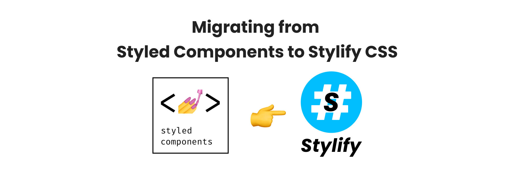
How to Effortlessly Migrate from Styled Components CSS-in-JS to Stylify Utility-First CSS for Better React Development.
Learn how to easily migrate to Stylify CSS for better React development.
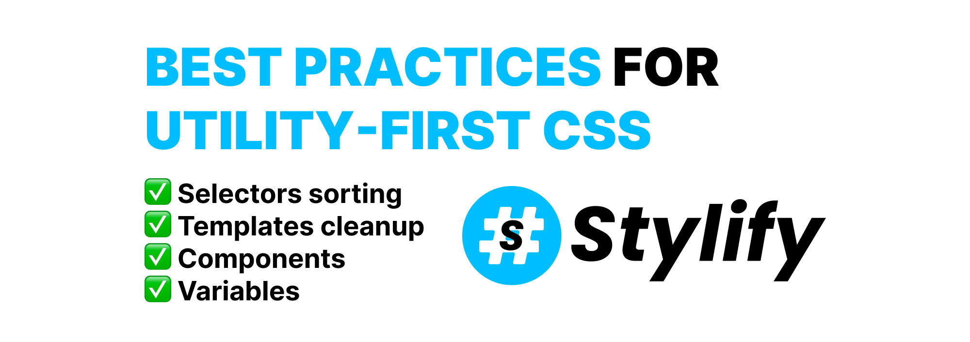
Best practices for utility-first CSS
Learn how to use Utility-First CSS effectively to style your website while avoiding bloated templates and maintenance difficulties.