Styling React App: Stylify CSS vs Styled Components
Styling React App: Stylify CSS vs Styled Components

Stylify generates utility-first CSS based on what you write. It works with any framework and with any tool. Styled Components is a library for styling React components.
This article is not about which tool is better but about comparing approaches when styling the app with these tools.
Introduction
Stylify is a library that uses CSS-like selectors to generate optimized utility-first CSS based on what you write.
- ✅ CSS-like selectors
- ✅ No framework to study
- ✅ Less time spent in docs
- ✅ Mangled & Extremely small CSS
- ✅ No CSS purge needed
- ✅ Components, Variables, Custom selectors
- ✅ It can generate multiple CSS bundles
Also we have a page about what problems Stylify CSS solves and why you should give it a try!
Setup
For all the examples below, I am going to use the vite-react setup.
Stylify requires the installation and a bit of configuration. It’s because the CSS is generated during a build before the app is initialized:
npm i -D @stylify/unpluginAnd the vite.config.js:
const stylifyPlugin = stylifyVite({
	bundles: [{
		outputFile: './src/stylify.css',
		files: ['./src/**/*.js', './src/**/*.jsx'],
	}]
});

export default defineConfig({
	plugins: [stylifyPlugin, react()]
});
You can try to edit the Stylify+Vite+React and Stylify+Next examples on Stackblitz.
Styled Components only requires to install the library and it can be used right away.
npm i styled-componentsSyntax and usage
When you want to style an element with the Styled Components, you can use the CSS API or create a component:
const Title = styled.div`
	color: blue
	font-weight: bold
`;

<Title>Hello World!🎉</Title>
The generated CSS looks like this:
.sc-bdVaJa {} .knKEua{color:blue;font-weight:bold;}Stylify on the other hand takes file content and generates CSS for each matched selector. Each selector is by default a utility and is generated only once.
The syntaxis by default native CSS property:value. Also, when writing values, you can use _ (underscore) instead of space and ^ for a quote. It is similar to Tailwind, but without having to learn and remember the custom selectors and shortcuts. If you know CSS you already know the Stylify CSS selectors. In case you need want shorter or custom selectors, you can add your own macros.
The selectors can be written right away without defining a component.
<div className="color:blue font-weight:bold">Hello World!🎉</div>CSS output:
.color\:blue {color:blue}
.font-weight\:bold {font-weight:bold}
However, nobody wants bloated templates with utilities. Sometimes the components are necessary. They can be defined globally in a config or locally in a file (through content options), where they are used. In the file, it expects a javascript object without the surrounding brackets. The definition is recommended within comments because almost any file format can handle comments. In Stylify the component is a CSS class and it can be used on any element:
/*
stylify-components
	title: 'color:blue font-weight:bold'
/stylify-components
*/
<div className="title">Hello World!🎉</div>
The title selector in the CSS is attached to each selector it requires. Because of that, there are fewer selectors/duplicates and the CSS is smaller.
.color\:blue,.title{color:blue}
.font-weight\:bold,.title{font-weight:bold}
When it comes to production, the selectors can be minified:
<div class="d">Hello World!🎉</div>.a,.d{color:blue}
.b,.d{font-weight:bold}Media queries
When we need a different style for various media queries, we can do that like this in Styled Components:
const Title = styled.div`
	color:blue
	@media (max-width: 768px) {
		color:red
	}
`;
With Stylify, you can use predefined screens or dynamic ones:
/*
stylify-components
	title: `
		color:blue
		md:color:red
		minw640px:color:orange
	`
/stylify-components
*/
<div className="title">Hello World!🎉</div>
Variables
Variables can be used within the Styled Components directly in the styles:
const Title = styled.div`
	color: ${props => props.color || "red"}
`;
Stylify allows you to define variables and then use them within the selectors:
/*
stylify-variables
	blue: '#005EB8',
	red: '#8b0000'
/stylify-variables

stylify-components
	title: 'color:$blue'
/stylify-components
*/
<div className="color:$red"></div>
When there is a case that we need various types of one button, we need to write the full selectors in stylify
<div className={`wrapper searchDiv ${isOrangeButton ? 'color:orange' : 'color:blue'}`}></div>Keyframes
The keyframes in the Styled Components can be defined like this:
const rotate = keyframes`
from { transform: rotate(0deg); }
to { transform: rotate(360deg); }
`;
const Rotate = styled.div`
animation: ${rotate} 2s linear infinite;
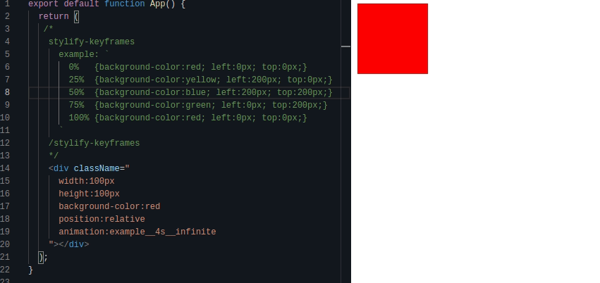
`;In Stylify CSS it looks a bit different
/*
stylify-keyframes
	rotate: `
		from { transform: rotate(0deg); }
		to { transform: rotate(360deg); }
	`
/stylify-keyframes
*/
<div class="animation:rotate_2s_linear_infinite"></div>
A simple animation example:
Plain selectors
When it comes to global styles and simple selectors, they can be defined within the Styled Components using createGlobalStyle:
import { createGlobalStyle } from 'styled-components';

const GlobalStyle = createGlobalStyle`
	button { color:red }
`;

<React.Fragment>
	<GlobalStyle />
</React.Fragment>
In Stylify, the same thing is achieved using plain selectors. The selectors are directly injected into the generated CSS file.
/*
stylify-customSelectors
	button: 'color:red'
/stylify-customSelectors
*/
<button></button>
Splitting CSS
The Styled Components doe’s a good job when it comes to optimization as it automatically splits the CSS into critical and noncritical and injects the CSS of those components that are used. However, the compilation is done when the app is running.
Stylify doesn’t work that way.
It generates CSS files according to your configuration and you have to tell the app when the CSS should be loaded.
You can configure a bundle for each page/component/layout separately. Even though you can split the CSS however you want, thanks to the utilities/components combination the CSS size is going to be relatively small as the selectors are generated only once. So sometimes it makes sense to have only Front + Admin CSS. Stylify website has less than 20 Kb and other websites are between 30-50 Kb.
One more feature is, that it doesn’t slow down the app because the CSS is generated before the app is initialized.
Thanks for help!
Also a big thanks goes to Luke Shiru for reviewing the information about the Styled Components.