Write Atomic CSS like Facebook with Stylify
Pixel perfect webdesign, atomic CSS, mangled selectors and minimalistic output? Yes 🤩!
Some time ago during a coffee ☕ break I have been digging through the Facebook CSS. I checked multiple pages, downloaded the CSS from them and got an idea on a tool that could simplify the way I write the CSS.
Laziness is a great thing. It leads people to simplify their work so in the end they have to do nothing. It also led me to create the https://stylifycss.com 💎.
When I have been digging through the Facebook code, I found the following.
Html:

CSS:
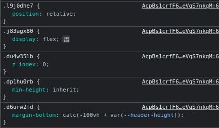
If you take a closer look, you can see, that they are using atomic CSS and they mangle selectors.
I have also found an article Rebuilding our tech stack for the new Facebook.com from Facebook itself in which they explain what have they changed for the new Facebook version. What the article also says is that they have been loading over 400 kB of compressed CSS and before switching to Atomic CSS.
From my experience, writing CSS manually is just slow and time consuming. Component frameworks are great until you start transforming every component. The Tailwind’s JIT is close enough, but I don’t like when I have to remember or search for the selector I want to use. I also need smaller chunks and integrate it into existing projects without increasing their size.
So the objective was clear. Create a tool that will be able to:
- Generate CSS separately according to content
- Mangle selectors
- Generate CSS on demand
- Use native CSS
properties:valuesas selectors by default - Work on its own without bundlers, frameworks and post/preprocessors
Introduction
Stylify is a library that uses CSS-like selectors to generate optimized utility-first CSS based on what you write.
- ✅ CSS-like selectors
- ✅ No framework to study
- ✅ Less time spent in docs
- ✅ Mangled & Extremely small CSS
- ✅ No CSS purge needed
- ✅ Components, Variables, Custom selectors
- ✅ It can generate multiple CSS bundles
Also we have a page about what problems Stylify CSS solves and why you should give it a try!
Atomic CSS with Stylify
Stylify ships with the native preset in which the selectors are the same like CSS property:value. Thanks to that I don’t have to remember or search for selectors. The Native Preset is optional and you can define your own selectors. It also provides the following features:
- Small chunks: it can generate CSS for each file, component, layout separately
- No pregenerated CSS: the CSS is generated only if a component or selector is found in the content
- Internaly combines and reuses selectors as much as possible to keep the CSS small
- Macros: can be used to define custom selectors like
m:20pxfor margin - Logical operands for screens: like
&&and||operands for screens combination likesm&&tolg:font-size:24px - Selectors mangling: from long
font-weight:boldto short_ab - No preprocessor, postprocessor or bundler is required
- On demand generated CSS: the CSS can be bundled on demand, for example during a request
- Because it can generates CSS separately and doesn’t bring any CSS by default, it can be easily integrated into an existing project without increasing its size globally
Write HTML. Get CSS. Mangle selectors. All automagically.
The example below and all its code can be found and edited on the StackBlitz.
In the example below there is a code for simple gallery image:
<div class="
	display:inline-flex
	position:relative
	margin:24px
	overflow:hidden
	box-shadow:0__2px__8px__#000
	width:300px
	md:margin:48px
	md:width:600px
">
	<img class="width:100% object-fit:cover height:auto" src="https://stylifycss.com/images/blog/stylify-facebook/mountains.jpg" alt="" />
	<div class="
		font-family:arial
		font-weight:bold
		font-size:18px
		position:absolute
		bottom:0
		left:0
		padding:24px
		background:rgba(0,0,0,0.7)
		color:#fff
		md:font-size:32px
	">
		Zakopané (Poland)
	</div>
</div>
The result of the code above will look like this:
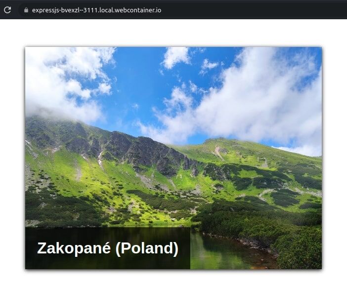
The code above would look almost the same if it would be written in pure CSS. Only the box-shadow uses the __ (two underscores) instead of a space.
Because of the maintainability and the fact that code above could be used in multiple places, it is necessary to make it more reusable. So let’s define some components, macros and variables!
Cleanup and Configuration
For the example above, I am using the following initialization that can be found on the StackBlitz (It is in the index.js and it is slightly changed in order to work in that environment):
import { Compiler } from '@stylify/stylify';

const content = '';

const config = {};
const compiler = new Compiler(config);
const compilationResult = compiler.compile(content);
const css = compilationResult.generateCss();
const mangledContent = compiler.rewriteSelectors(content, compilationResult);
Let’s add the shadow variable first into the compiler config:
config.variables: {
	shadow: '0 2px 8px #000'
};
When the variable is defined, we can use it like this: box-shadow:$shadow.
The Native Preset is not required. You can define your own selectors. For example for the margin it would look like this:
config.macros['m:(\\S+?)'] = (match) => {
	return {'margin': match.getCapture(0)}
};
When the macro is defined, it can be used with custom values like m:24px and md:m:48px.
If multiple and the same selectors should be used in multiple places, it is a good practice to define a component for them in order to simplify the maintainability and readability:
config.components = {
	'gallery-image__wrapper': `
		display:inline-flex
		position:relative
		m:24px
		md:m:48px
		overflow:hidden
		box-shadow:$shadow
		width:300px
		md:width:600px
	`,
	'gallery-image': 'width:100% object-fit:cover height:auto',
	'gallery-image__label': `
		font-family:arial
		font-weight:bold
		font-size:18px
		position:absolute
		bottom:0
		left:0
		padding:24px
		background:rgba(0,0,0,0.7)
		color:#fff
		md:font-size:32px
	`
};
It is also a good practice to add the box-sizing:border-box to prevent the wtf moments somewhere in the future:
config.customSelectors: {
	'*': 'box-sizing:border-box'
};
With all the enhancements above, the finall code is a way smaller:
<div class="gallery-image__wrapper">
	<img class="gallery-image" src="https://stylifycss.com/images/blog/stylify-facebook/mountains.jpg" />
	<div class="gallery-image__label">
		Zakopané (Poland)
	</div>
</div>
Minification and Optimization
Under the hood the Stylify optimizes the CSS in the following ways:
- The selectors and components are generated only when found in the content
- It tries to reuse the selectors as much as possible
- It transforms the long selectors like
font-weight:boldinto the short ones_ab12
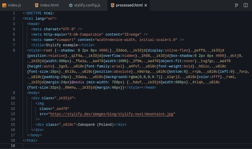
Below is an image from StackBlitz with the processed and optimized output. The CSS (without new lines and spaces) has only 0.78 Kb:
