Material Theme Builder (Material You) generated theme integration
If you plan to use Material Theme on your website, you might want to generate a color palette and theme using Material Theme Builder.
Try it on StackBlitz
Material Theme Builder generates CSS files containing variables for light/dark mode for your project. It allows you to set up your desired color palette in no time. Below is a guide on how to generate a theme and how to integrate it into Stylify CSS.
How to get a custom Material Theme
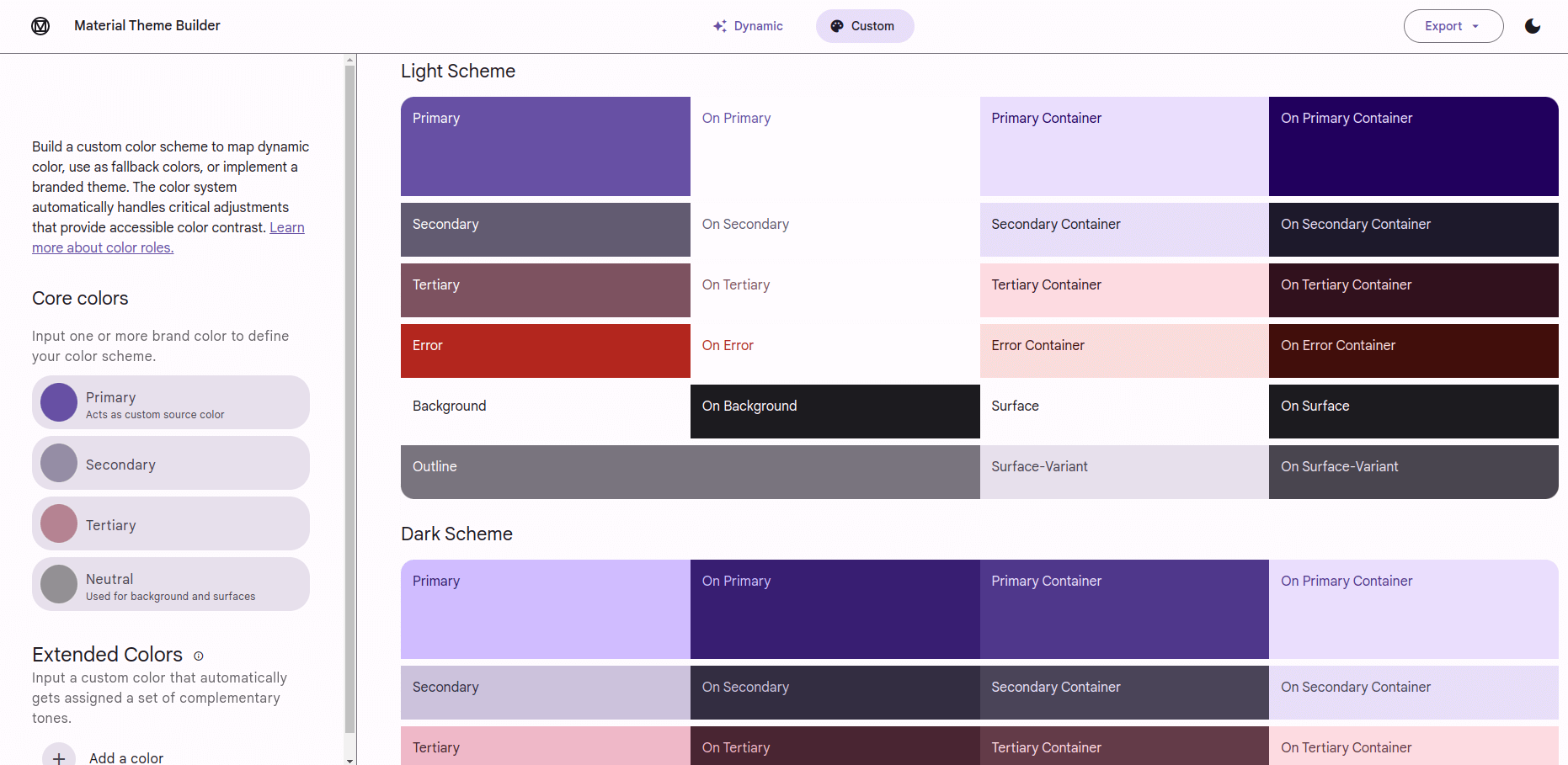
Generating the desired theme with the Material Theme Builder is simple:
- Go to the Material Theme Builder website.
- On the left side (on Desktop), click on the primary color.
- The color generator dialog will appear. Select your favorite color.
- Optionally, repeat this process for a secondary, tertiary and neutral color.
- When you finish the configuration, in the top right corner, there is an export button
- Click on it and select Web (CSS).
- Download the file and extract it into your project.
In case you wonder, how to use each color, make sure to check out the section under the device preview. There are color palettes with the name of each color:
- For example
on-primarycolor should be used for text onprimarycolor. This means for example a button with primary color background (purple) and on primary text color (white) - Colors are split for light/dark mode
- The complete guide can be found in material theme docs
Integrating Material Theme into Stylify CSS
To finish the configuration process, you have to configure Stylify, so it knows, that variables starting with md- are external and that it has to replace variables with CSS variables instead of their value.
With Unplugin
This part is for @stylify/unplugin exports: stylifyVite, stylifyWebpack, stylifyEsbuild and stylifyRollup.
If you use unplugin in your project (Next.js, Nuxt.js, SvelteKit, Vite, Webpack, Rollup or any other), this guide is what you are looking for.
So in case you use one of them in your project, this is the configuration for it:
const stylifyConfig = {
	compiler: {
		externalVariables: [
			// Add external variables identifier
			// This one checks, if variable starts with md-.
			// If so, it is marked as external.
			// Do not add --md. Identifier methods works with Stylify variable name
			// and not CSS variable name. Stylify adds -- automatically
			// if CSS variables are enabled
			(variable) => {
				if (variable.startsWith('md-')) return true;
			}
		]
	}
	// ...
};

stylifyVite(stylifyConfig);
stylifyWebpack(stylifyConfig);
stylifyRollup(stylifyConfig);
stylifyEsbuild(stylifyConfig);
Astro integration
The config is the same like for unplugin.
stylify(stylifyConfig);Bundler
In case you use @stylify/bundler directly, use the stylifyConfig from the above section about Unplugin Integration, but you have to pass it into the Bundler initialization.
const bundler = new Bundler({
	...stylifyConfig
});
Usage
The final step is to import the generated theme into our project:
- Extract the generated theme into your project.
- Import the
theme.cssfile into your project (make sure the directory is public). This file will import all other necessary files.
@import rules within the theme file.
You might want to copy the content of those other files into the theme.css file or merge them using some bundler to decrease the number of requests.When the file is imported into your project, you can start using Material Theme CSS variables in Stylify utilities.
<button class="
	border:none
	padding:8px_12px
	border-radius:24px

	background:$md-sys-color-primary
	color:$md-sys-color-on-primary
	display-large
">Material Button</button>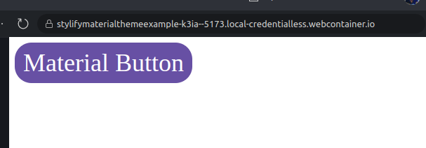
Cleanup
In case you plan to use Stylify CSS utilities only, then you can remove the colors.module.css. It contains utilities for color and background.
Apart from the colors module, there is a typography.module.css. You might want to remove it as well and rewrite these classes into Stylify components using Stylify dynamic components syntax.
const stylifyConfig = {
	compiler: {
		components: {
			// Example for display class
			// This matches display-small/medium/large
			// and returns utilities dynamically based on the matched size
			'display-(small|medium|large)': ({ matches }) => `
				font-family:$md-sys-typescale-display-${matches[1]}-font-family-name
				font-style:$md-sys-typescale-display-${matches[1]}-font-family-style
				font-weight:$md-sys-typescale-display-${matches[1]}-font-weight
				font-size:$md-sys-typescale-display-${matches[1]}-font-size
				letter-spacing:$md-sys-typescale-display-${matches[1]}-tracking
				line-height:$md-sys-typescale-display-small-height
				text-transform:$md-sys-typescale-display-${matches[1]}-text-transform
				text-decoration:$md-sys-typescale-display-${matches[1]}-text-decoration
			`
		}
	}
}
